In the digital world there is way too much of industry terminology and acronyms that are confusing and perplexing to us normal folk. In a business that bandies about insider jargon from conversion rates to latent semantic indexing, it is comforting to find something which does exactly what it says on the tin.
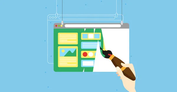
A landing page is simply the page that you land on once you have clicked on a link (either in an ad or anywhere else). As the page where the link ‘lands’ you, a landing page offers a unique opportunity to engage potential customers to take immediate action.
In the jargon of the industry, a landing page leads you to a CTA or A call to action.
A good landing page is designed to generate leads or enquiries for potential client interaction. A good landing page gets you an excellent conversion rate, which in any language means that your clicks are turned to actions and ultimately, into sales.
If your landing page is currently getting you a good ‘conversion rate’, there may be room for improvement. The following hints & tips could help you increase the number of enquries or sales your website generates or if you are new to this method of inviting potential new business then read on
What makes a good landing page?
 First impressions last.
Make the invitation to your landing page enticing by crafting powerful & interesting headlines.
Here's a Good Landing Page Example.
Once potential customers have clicked through and arrived on your landing page, keep them interested with a simple message that gets your point across quickly. It is worth remembering that most people only scan the internet and read less than 30% of what you write. Bullet points, short paragraphs and numbered lists are the way to go… so…
- Have a clear, persuasive Call to Action: The main object of your landing page should be clear and persuasive. Give a simple explanation of what you are offering and an enticing invitation to action ‘Sign up Now!’ or ‘Create my account’…etc.
- Keep a consistent message: Mirror the wording of the ad or headline with the actual ‘landing page’ content. Research shows that potential clients get confused, and even irritated, if the landing page does not reflect the click invitation. It may negatively impact on your brand.
- Ask for the minimum amount of information: Prospective clients prefer a succinct contact form and can get a little nervous if you ask for too much information. Keep it to names, contact details and let the follow up do the rest.
- Swift Action on those leads: A potential customer who has communicated through the landing page option should receive an acknowledgement, a welcome email or follow up in good time to instil confidence and keep that ‘landing page’ working well for you.
A successful landing page should yield a high volume of conversions and quality leads. If you would like more advice on how to tweak your ad’s and landing pages,
contact our expert Digital Marketing team and start a conversation today.

 First impressions last.
Make the invitation to your landing page enticing by crafting powerful & interesting headlines. Here's a Good Landing Page Example.
Once potential customers have clicked through and arrived on your landing page, keep them interested with a simple message that gets your point across quickly. It is worth remembering that most people only scan the internet and read less than 30% of what you write. Bullet points, short paragraphs and numbered lists are the way to go… so…