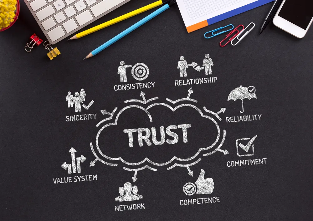
The Trust Stack is fast becoming a common term for how people are interacting with companies and individuals online. The formal definition, according to Rachel Botsman, is as follows:
A new trust framework is emerging in the collaborative economy, the ‘Trust Stack’. In the first layer of the Trust Stack, people have to trust that a new idea is safe and worth trying. The next layer is trusting the platform, system or company facilitating the exchange. And the third layer is all about trusting the other user.
Trust or faith in ecommerce as a concept has been well established but if you are involved in ecommerce you need to pay attention to that second layer, "Trusting the platform". When a new customer is contemplating a purchase from your platform they are dealing with uncertainties. Is this the right product? Is that the best price? When will I get it? Along with a host of other concerns that give the average new customer a high level of uncertainty.
A good ecommerce website will do everything it can to lower that uncertainty which in turn builds on the trust the customer has in you and your business. Sounds good right? But how do they do it? Here are some key factors that you should look to address at two key stages of the purchase process, the product details page & the checkout process. These pointers are based on a traditional product based ecommerce process but many of them can be applied to any website.
Below is a screenshot from our friends at babyaccessories.ie the page layout is clean and simple but there is a lot of elements here that create trust with visitors
All of these elements reassure a visitor and make them much more likely to click on the all important "add to cart". This is a great start but it is only half the battle. Lets move on to the checkout process.
Cart abandonment rate online is somewhere between 60-80%. You can lower your percentage by continuing to build trust and lower your users' uncertainty. Here are some pointers to consider:
When a customer visits the cart you want to make it very simple to start the checkout process. The cart should have only the essential information for a customer to make that decision. Keep your cart simple by making the options for removing or updating quantities of products obvious. Show your delivery options clearly and make sure the customer can see the total cost at this point. In addition, an eye catching checkout button that is visible above and below the cart summary. Do not make your customer look for twice for it.
The most common first step for a checkout is to ask the user to sign up or log in as a member or checkout as a guest. This is a bad idea. A first time customer does not want to join your club or become a fan. Pushing them at this point can drive them in the wrong direction. It is far better to let them checkout as guest and ask them to join afterwards (preferably with a bonus for doing so) If the customer is already a member they just need a simple log in link.
Customers are getting used to having it their way. Providing customers with options for payments (PayPal, Stripe, etc.) gives them control. The same goes for your delivery options. Express delivery, standard 3 day delivery or collect in store? Don't assume you know what is best for your customer.

If you spend time studying how visitors behave on your website you can find hundreds of ways to lower their uncertainty and increase your revenue. If you would like us to take a look at your platform why not mosey over to our contact page and we can start a conversation.
We recently opened a new office in Manchester!
For all your eCommerce Website Design & Development needs in Manchester, speak to our U.K based team Today >>>